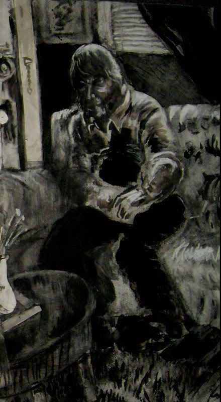
I'd like to look at one of my fine art drawings for this lesson today. This work is a mixed media collage/ drawing consisting of mostly charcoal, ink, white conte', matte medium, and charcoal paper. There are also staples and pieces of scotch tape in the piece to add depth and texture.
I've titled this piece, "The Quiet Man", which is also the title of a John Wayne movie that I enjoy.
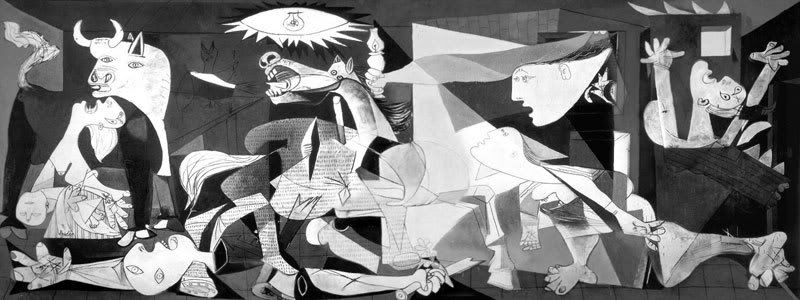
I like to go to the library and study what other artists have accomplished when approaching goals similar to mine. Since, I wanted to do a piece about the horror of hearing loss, I needed to find a piece of anguish. The most notable influence on this piece is Pablo Picasso's "Guernica", which captures the horror of bombs being dropped on a city.

The distortion of figure and the flow of catastrophic movement really transfixes the viewer . You can't help, but have a reaction to a piece like this. However, I didn't want to just copy Picasso's technique, so I attempted to divine which portions of his work were the most effective in their communicative properties and drew my influence from that instead. In other words, I needed to find a way to express the emotion of his work without stealing his techniques.
I also wanted to consider what more contemporary artists were doing to express more shadowed emotional content. Two artists in particular really stood out to me: Kara Walker and William Kentridge.
Walker's work, with its projected backgrounds and silhouetted figures creates a disturbing story that is very real despite its fantasy elements. She tends to rewrite history, creating a confederate south that never really existed, but still spoke to the truth of the era. Walker's use of silhouette creates mystery. While the projected background enables the audience to further enter into the work itself,casting characters onto the scene made by their own silhouettes.
Here is an example of her work:

William Kentridge is a South African Artist who constructs short films out of charcoal drawings that he photographs, erases, and redraws repeatedly to form stop motion animation. His works are usually politically charged and disturbingly haunting. The erasure of the charcoal creates ghostly leavings of old mark makings.

Because "The Quiet Man" was to be about my own father, I wanted to create something meaningful. I had abandoned the idea that my art should be pretty and instead embraced the raw and disturbing beauty of uncorked frustration. I've long had a sense of inner turmoil over the gradual loss of my Father's hearing. It doesn't seem fair that the man who raised me, taught me, and who I know to be so intelligent and brilliant to be treated like a lesser human being, a child even, by those he can't quite understand in conversation anymore.
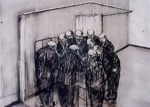
Initially, I was so caught up with the idea of shocking the viewer, that I embarked on a rather impersonal and shocking project about the world having its hearing stolen. I even did some sketches you can see here of the horrible fate being visited upon the people. Unfortunately, it was all rather dramatic and impersonal.
This just wasn't right and it didn't really get down to my true sadness, which wasn't hearing loss itself, but rather the lonely life my Dad has to lead because of his disability. It seemed risky to get so personal because I never had before. I always stayed just a little bit aloof even from my own work. However, immersing myself more honestly enabled me to express myself through art more effectively then I ever imagined I could. This is the first drawing that I've ever done, that caused me to cry because of it.
I decided to do charcoal drawings like William Kentridge, but put my own stamp on it by mixing matte medium with my charcoal underdrawings. This created a painterly effect, bringing forth deep rich tones. I added contrast with black ink and white conte'. These were done atop cut out pieces of paper because I wanted the piece to be three dimensional, even if it only a millimeter or two above the base surface.
What I started with is a simple drawing of my Dad, sitting on a couch in my living room.

I chose to draw a scene set in my own living room. What better way to effectively describe the alienation my Father, than by incriminating my own family? By accepting the blame as someone who inadvertently treats my Dad in the very way I've come to despise and resent, I could also express an even more personal emotion about this situation: Guilt. I felt guilty because I couldn't help him, and if anything, I make it harder for him by not accommodating his situation a little more.
I used a classic triangular composition to keep the eye moving around the page. The piece is weighted toward the left, where my brother's gaze will even slide you off the page, but there are directional cues to bring the eye back. This compositional slide creates tension because there are elements fighting to draw the eye back. Eventually, despite the chaos, the gaze of the audience moves toward the solitary figure of my Dad, sitting quietly on the couch, with his hands cupped together. His body language is very closed and non-communicative. He gazes somberly back to the left, which leads to my family.
On a side note, I think it is important to tell you that I wanted my Sister to be the link to my Father in this piece because she herself is also losing her hearing. That's why she stands "higher" both physically, and also symbolically, as she can not be held in guilt of the crime of alienation. I rendered her with tape over her mouth to express that she is not caught up in her own words and interests like every one else.

I also used the three male characters as "tent pegs" of sorts to anchor the composition. This also enforces the triangular flow that I want the eye to follow. Below I've highlighted the triangular flow in red. Note the run-off on the left side of the page. The three blue boxes highlight my tent peg anchors that keep the composition weighed down. These weights serve the purpose of giving the eye a focal point to occasionally rest on as it travels around the page, which can sustain the viewer for longer periods of interest.
The piece is in shades of gray, lacking the warmth of color. I've accentuated and distorted the anatomy of the characters, particularly the mouths, almost grotesquely, to make these characters almost monstrous. I want you to sympathize with the lone figure to the right of the page once you get past the horror of what is going on.
I hope you enjoyed this long and exhaustive explanation of my own artistic process. I'd love to hear any feedback on whether this was an effective example of my process, and if it helped anyone in their own studies.


