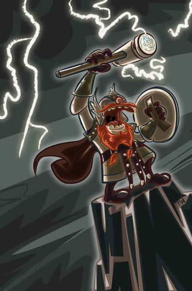
Today we're going to take a look at how to construct a drawing of Bolt Thundersmite, Dwarf Cleric of T'oerr. Bolt is a character from a fantasy adventure called, The Adventures of the Sudsy Fist Expedition Company.
Step 1: The Sketch
So, It's usually a good idea to start out with a loose sketch to get a feel of the character, work out line flow, and give the picture as much energy as you can before it goes to the computer. You'll notice we angled the sketch here so the action flows diagonally.
I like the loose and powerful energy of the sketch, so we should really try to retain that as we move to the next step.
Step 2: Line Weight, Inking, and Spotting of Blacks
Next, we'll take the piece into Adobe Illustrator and begin our "inking" process. This is a meticulous combination of using the pen tool to get precise curves, and working with a combination of Illustrator's brush tool and your stylus to get a less perfect line. A word of advice: Too much precision zaps the energy away.
If you don't have a digital stylus, no worries. Your mouse will be fine, but it might take a few more passes to get the lines you want.
The heavy areas of black on the mountain, and in Bolt's mouth serve to anchor the composition or give "weight" to the drawing. In other words, you'll give the eye a resting point as it moves around the piece, (this process is known as spotting blacks)
As we digitally ink our hero, it's also important to vary the line weight, or thickness of line to give our character more dimension. If all of the lines are the same size, the viewer's eye can more easily pass over our image. We want to lock them in with some variation.
Step 3: Flat Area Coloring
Now we'll need to make some color choices for our character. For our colors, we'll take the image into Adobe Photoshop. Bolt wears plate metal armor, but we don't want to just color it with a simple, boring desaturated grey. Instead we'll use tones of purple. Purple just feels a little stormy.
We'll vary the light and darkness of the purple to give his armor a pieced together look. And for his cape, boots, and leather straps, we'll also use purple, but make it more saturated, dark, and rich to differentiate it from his armor.
Since we're using purple for the main character, we'll contrast that in the background with purple's opposite color, yellow. A yellow sky also makes a nice choice for a storm because it's not the color sky we'd necessarily expect.
In this stage, we'll also go ahead and crackle up our lightening and give it a glow so we can see how our color choices will look with it. This glow effect can be achieved by duplicating the lightening in another layer in Photoshop, and blurring the lower layer a little.
Step 4: Coloring Your Lines
This step is optional and really comes down to personal preference. Colored lines do tend to look a bit more dimensional since they don't weigh the eye as much, but if you want to keep your lines black, just skip this step.
Step 5: Highlights and Shadows
This is where it gets really exciting. The shadows and highlights are really going to give dimension to our hero.
It's important to remember that the lightning is striking overhead and behind Bolt so he will be mostly back and top lit. As you ad shadow, you'll want to saturate your colors a little more, but be careful not to overdo it.
Bonus Step: Background Contrast
This is technically still part of step five, but here we'll add a few more shadowy areas to give our storm a little more muscle. You could add some highlights here, too if you'd like, but be careful not to draw focus from bolt.
And there you have it. Oh, and just for fun, here's another version of the colors that adds even more drama with a darker background.
-Dave


