Words and images by David Finley
Greetings, Scofflaws!
Today's post is a tutorial explaining my process in the creation of this piece below.
Today's post is a tutorial explaining my process in the creation of this piece below.
A little over a week ago, I posted an article depicting a scene from a parody of Mary Poppins I am writing. If you would like, you can look and see some concept sketches and visual development on the characters from that previous post by clicking, here.
Today, I am going to follow my article up with a series of images involving those same characters, and explain the process I use to establish the visual look for this story.
With this particular drawing, I sat down with my sketch book and some markers putting down the first thought that came into my head. I enjoy sharpies because they don't allow me much room for meticulous detail or careful planning. They are powerful and bullish on the page, often bleeding into the paper. I don't have to care that the resulting drawing is crude and ugly, as long as it does its job.
At this point, the drawing is not even close to being polished and I'm not completely happy with the body language of the characters, but it establishes the tone and humor I'm trying to convey.
I've added lines of action, which are imaginary guides that control the directional flow of the eye across the picture.
In my reworking, I tighten up the body language of the characters. I want the robot to be more delighted, upright and alert with his lines of action pointing the viewer to the wall behind him. The cat has good southern-belle characterization in the sketch, but I want to draw her lines out further to add grace and elongate her body lines.
 |
| Here you can better see the directional flow the lines of action give the piece. They are positioned to lead the viewer's eye in a pattern of direction ending with the robot's cane. |
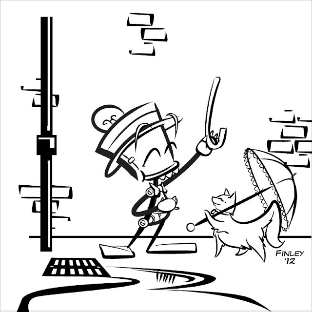
Now it's time to open Adobe Illustrator to tighten up and "ink" the linework.
The result is much closer to my original vision. I've also redone the background. It is still seedy, but I've taken away the needle and trash to avoid stealing focus from the graffiti that will be placed on the wall behind the characters.
My result is cleaner, and slightly more dynamic. The lines used to render the characters and the water curve and flow diagonally, giving them a more kinetic and moving feel, while also contrasting with the heavy and stable vertical line of the pipe, and simple and at-rest horizontal line of the ground.
It is also important to mention line weight, or the thickness of the lines. Thicker lines will bounce toward the eye faster than thinner lines. Balance is key with this device. It is important to use both thin and thick lines to avoid visual monotony. Thicker lines should be used to anchor, while thinner lines are useful for detail, and contrast.
 |
| Power to the People. |
At this stage, I insert the graffiti into the background. It was a lot of fun to design and create this graffiti myself. Because the graffiti is so kinetic and visually active, we do have the unfortunate problem that it threatens to bury the main characters and steal focus.
I then change the color of the graffiti from black to blue, which helps, but doesn't totally fix the problem. We want some focus on the graffiti, because in a sense it is a character, too, but in it's current state, it is still a bit too powerful.
We'll try to fix that with some simple color and shading choices.
 |
| Very Gene Kelly. |
You'll notice I've added a dialogue balloon to complete the punchline.
The first color treatment I apply is an analogous, or blue tone color treatment. I really like this look, and I am tempted to keep it. It creates an old fashioned, and nostalgic feel that aids in portraying the innocence of the characters, but the characters are still getting just a little lost.
I have added color to the foreground characters, but have retained the monochromatic treatment of the background elements. The blue background color scheme contrasts nicely with the oranges, and reds used on the characters.
So, there you have it. The result is clean, and dynamic with nice color contrasts. I would still like to find a way to use the monochromatic color scheme, but this is just a concept drawing and there is a lot of room to shift..
Thanks for reading!


